Proliant
ProDash
Product Design
UX research
Product Management
Product Strategy
UX research
Product Management
Product Strategy
2020-2022
Scroll Down

Situation
Proliant had previously built a dashboard system—but it barely saw any usage. Users were required to build dashboards from scratch, and there was no intuitive workflow or inspiration to guide them. What existed were boilerplate widgets offering nominal data—few of which served actionable purposes. When all was said and done, close to zero users in the entire Proliant customer rolodex were using this product.
Tasks
My role was to overhaul this underperforming experience. I needed to transform the dashboards into a control center that users would rely on daily—a central hub tailored to the specific needs of Proliant’s HCM (Human Capital Management) suite.
Actions
This had quickly become a 0 to 1 project. Initial discussions happened around a "re-skin" of the current dashboard widgets, but it didn't solve some of the major issues exposed in initial discovery and usability research. We had to pack a lunch and do some deep digging to make sure this project met its goals.
- Conducted stakeholder interviews — with product owners from each segment of the Proliant suite, as well as development, and company leadership to align on goals and user pain points.
- Performed competitive analysis — within HCM & beyond to understand industry standards and opportunities for innovation.
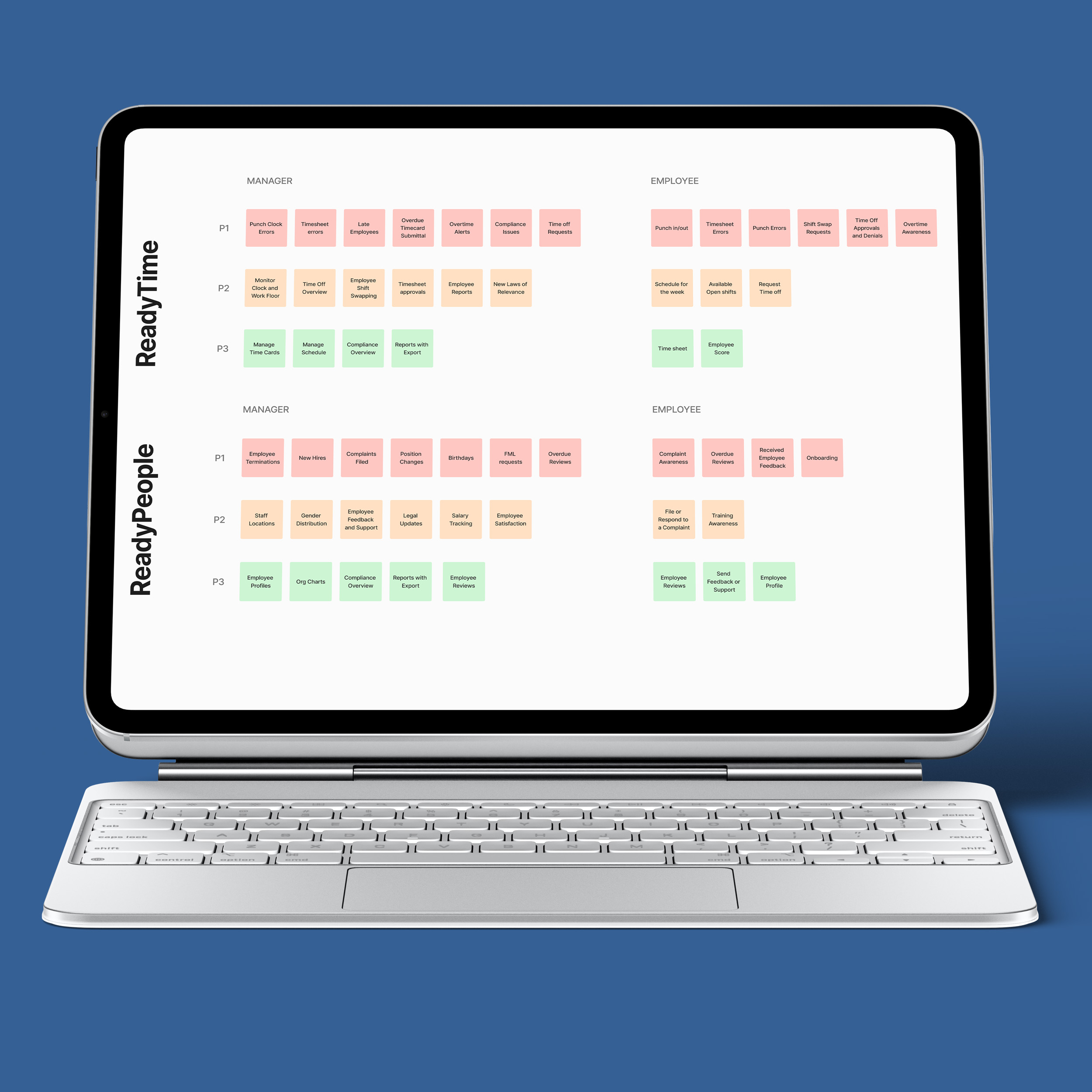
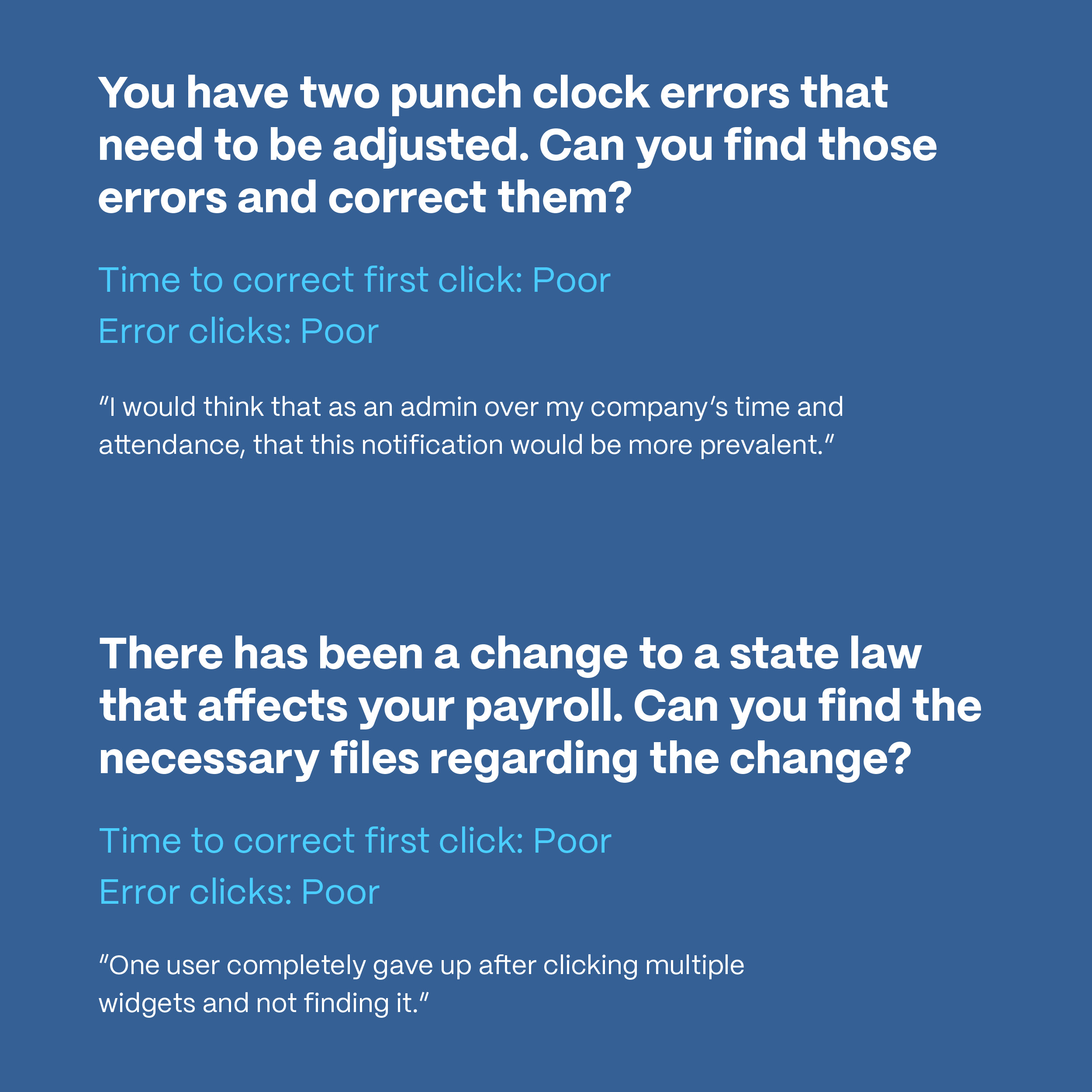
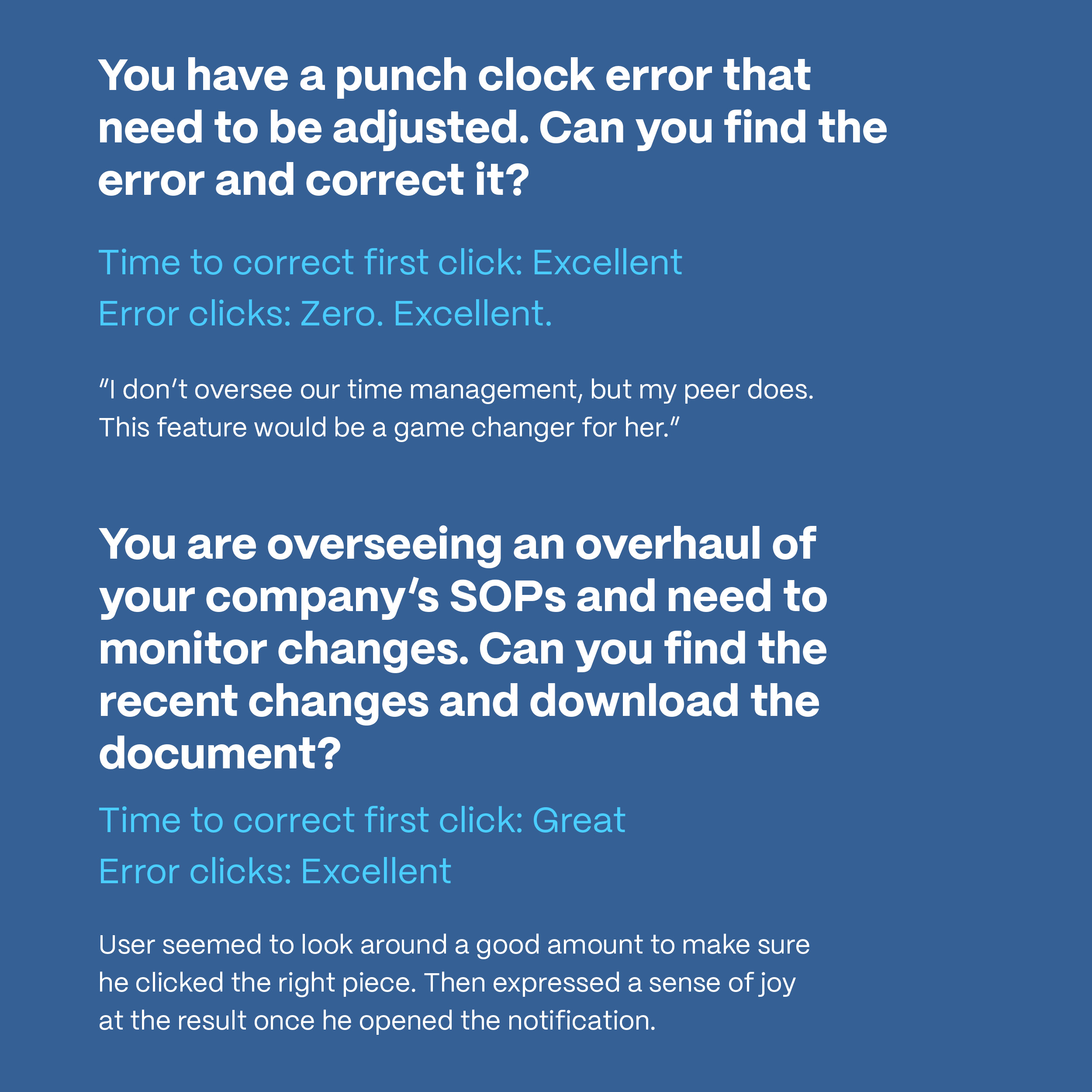
- 2-tiered user research— Conducted qualitative research focused on key usability metrics such as readability, speed-to-click, and overall feature satisfaction. These studies were conducted on two different versions of options for the dashboard overhaul & validated the new experience.
- Engineered user flows — Based on the stakeholder interviews, we needed to figure out what the best solution was that would solve for 90%+ of use cases. Resulting in ....
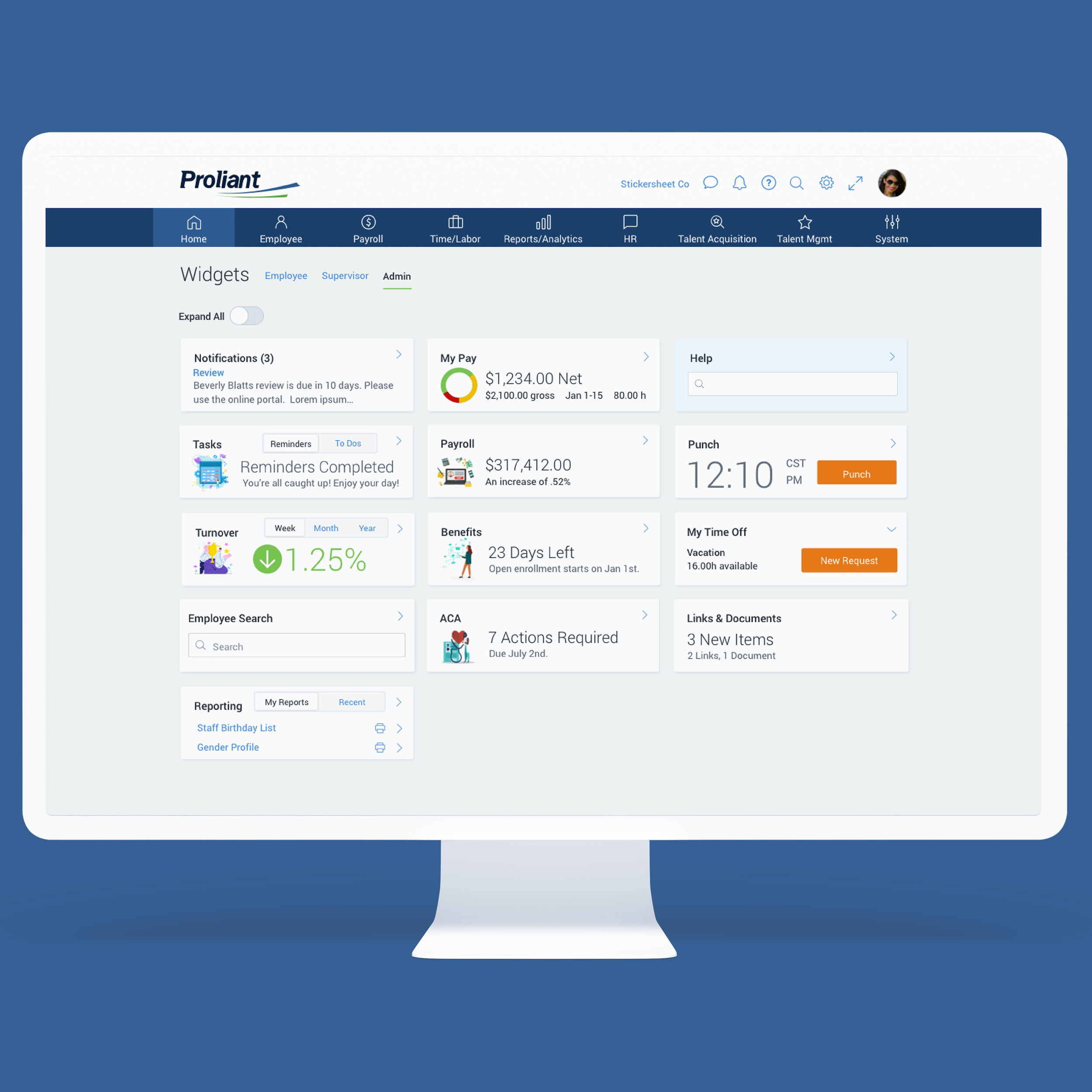
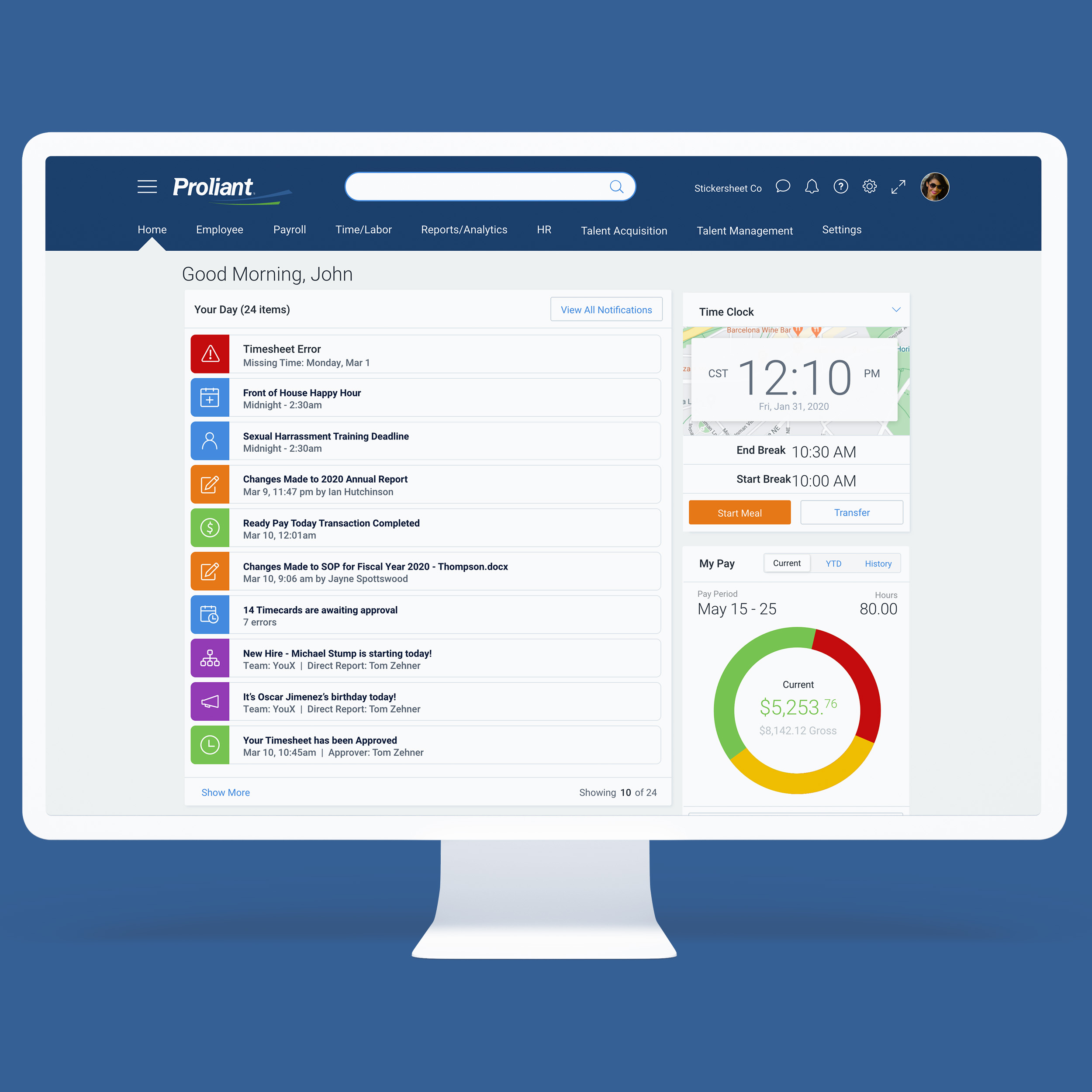
- New home dashboard defines new three-tier priority pyramid — I saw the opportunity for a notifications-driven home dashboard that would be supported by product-specific dashboards, and then the traditional product interactions. The belief was that the home control center would be a place that would become the most used section of the product suite.
Results
I was hired for my role as Director of User Experience at Obermeyer before this project began development. So while the page doesn’t include hard metrics like adoption rates or productivity gains, the shift was foundational—reimagining how users engaged with and benefitted from their HCM workflow daily.
- A control center, more than a dashboard — A central control center for proactive, actionable workflow—not just passive data presentation. The belief from users was that this was a path to recovering hours of time per week spent on tedious tasks.
- Research backed the concept — Users could complete tasks faster, with fewer clicks, and with newfound delight.
- Same data, new experience — The data & interaction models that I built, utilized existing data & interaction flows. We were able to change the experience without injecting much of anything new.
- A newfound layer of personal efficiency— Proliant’s HCM suite became dramatically more engaging and efficient. A user could knock out most tasks that required immediate attention in either the first or second step of the dashboard pyramid.
Discovery & Design Strategy


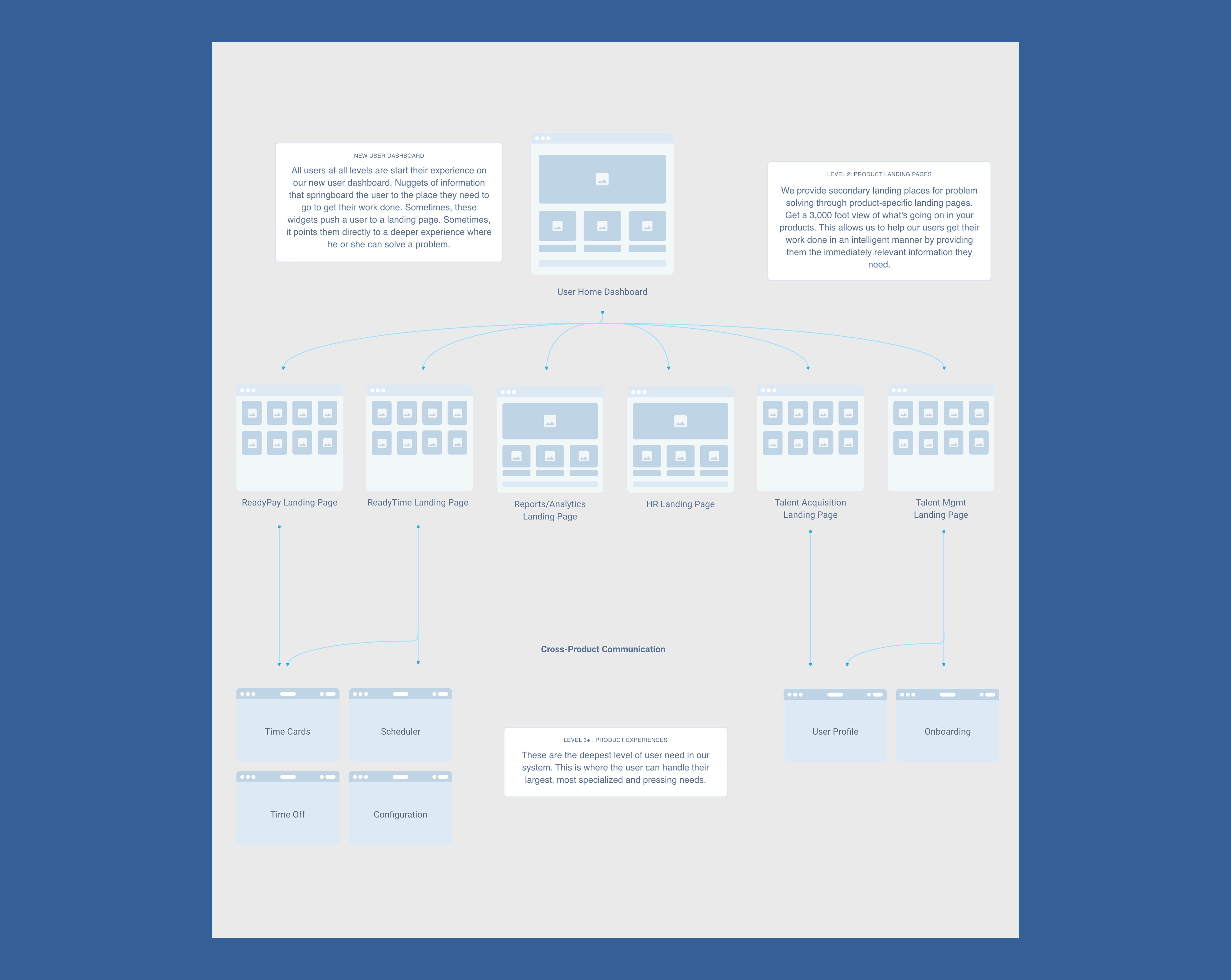

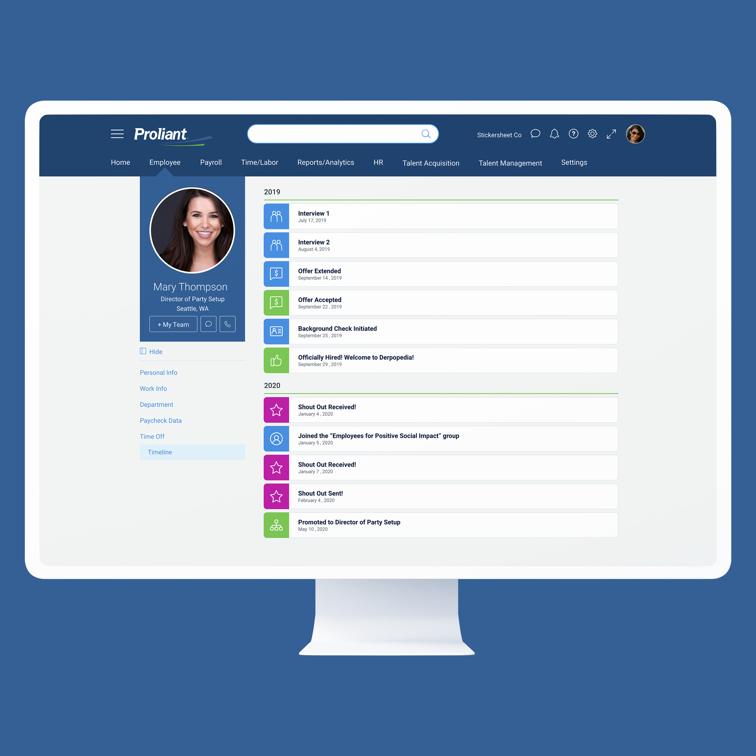
Home Dashboard
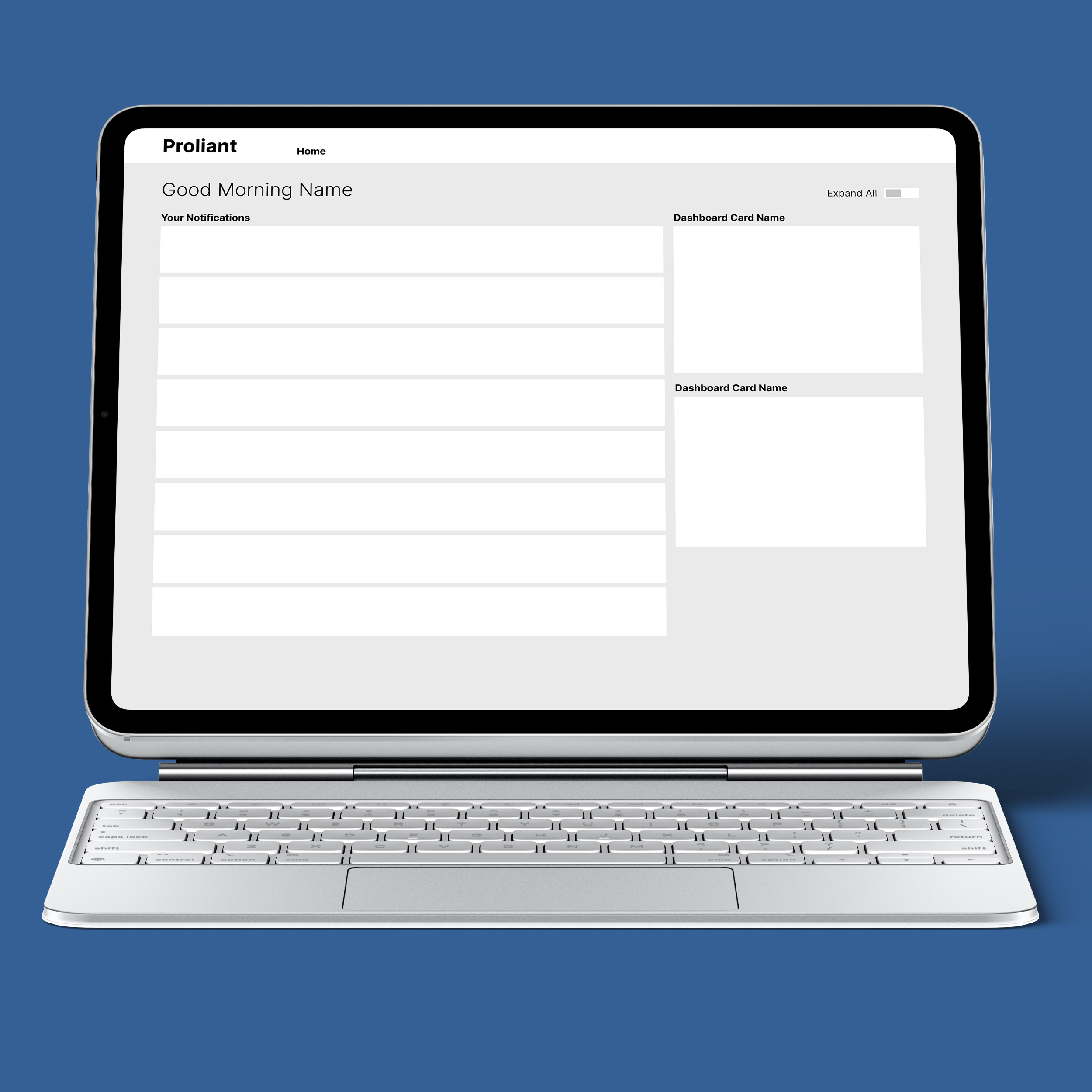
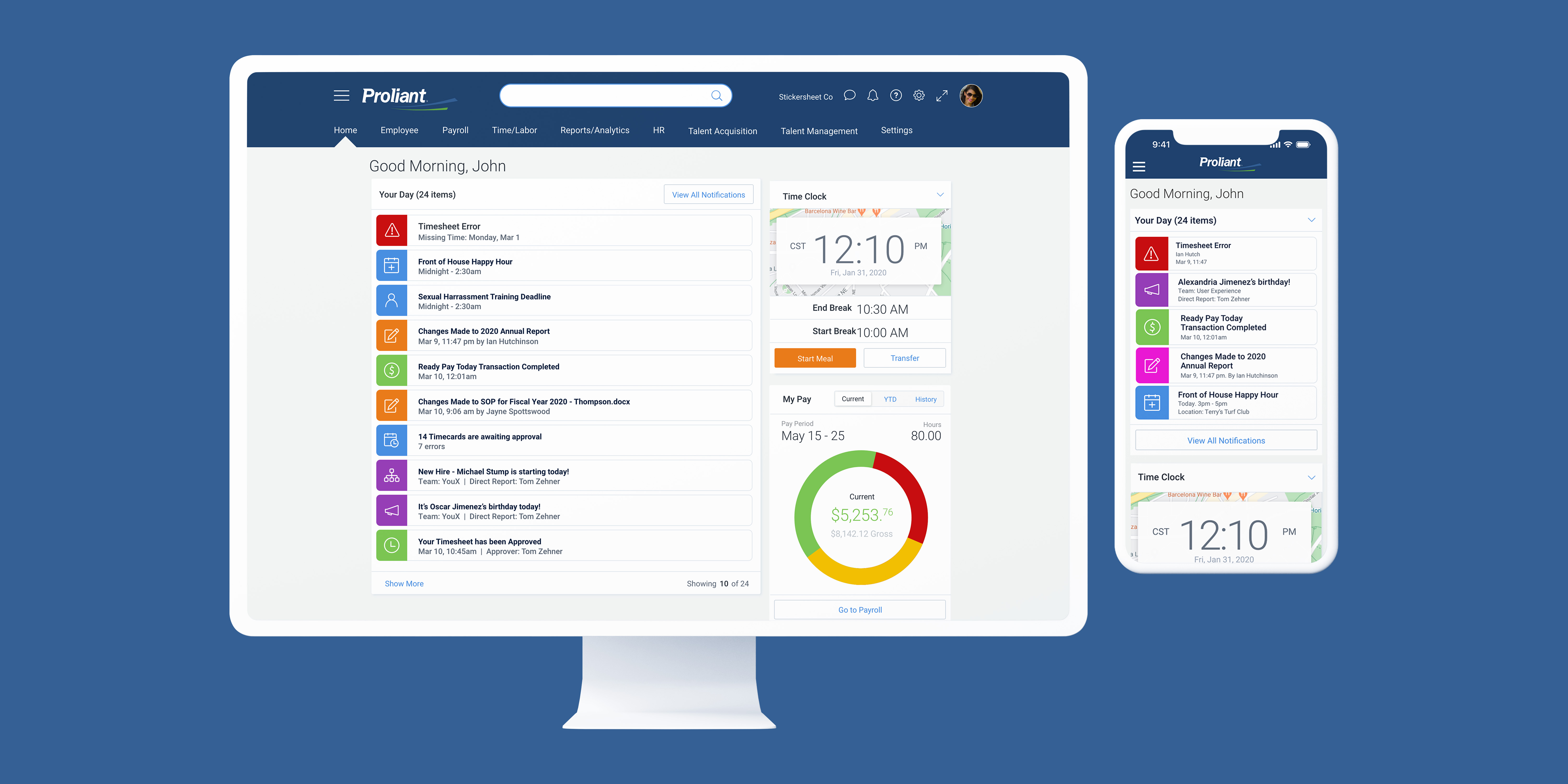
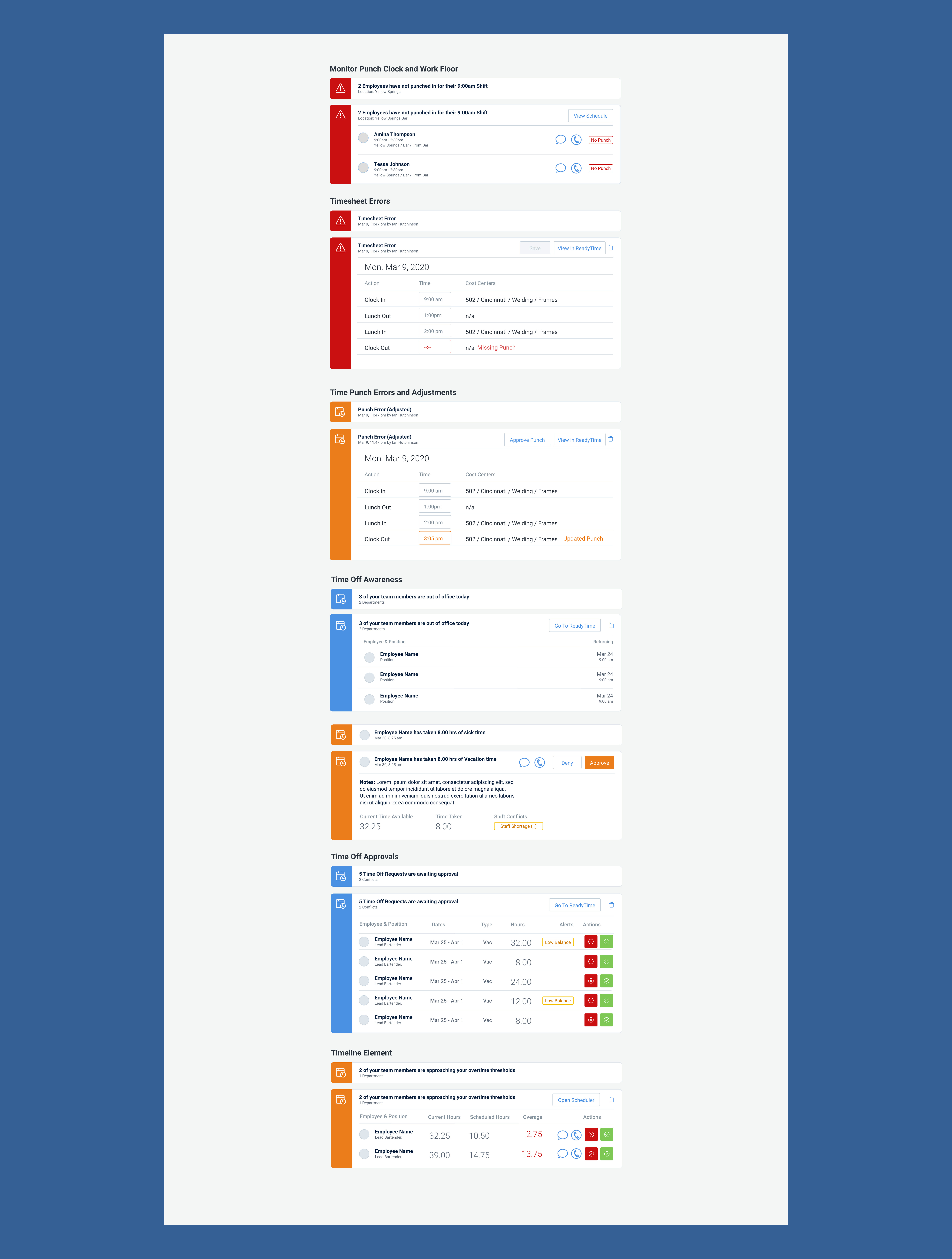
The foundation of the entire concept was a home dashboard. A control center where the user could essentially address all errors & outstanding issues in one place. It consisted of actionable notifications that would erase hours of time spent on tedious tasks from the user's day. If a user wanted to correct a timesheet error, he/she/they could open the relevant notification & approve a change, or make an edit in the same way that the timesheet app allows for. This design could scale for the artificial intelligence future, as the widgets were pulling information from the app suite already.
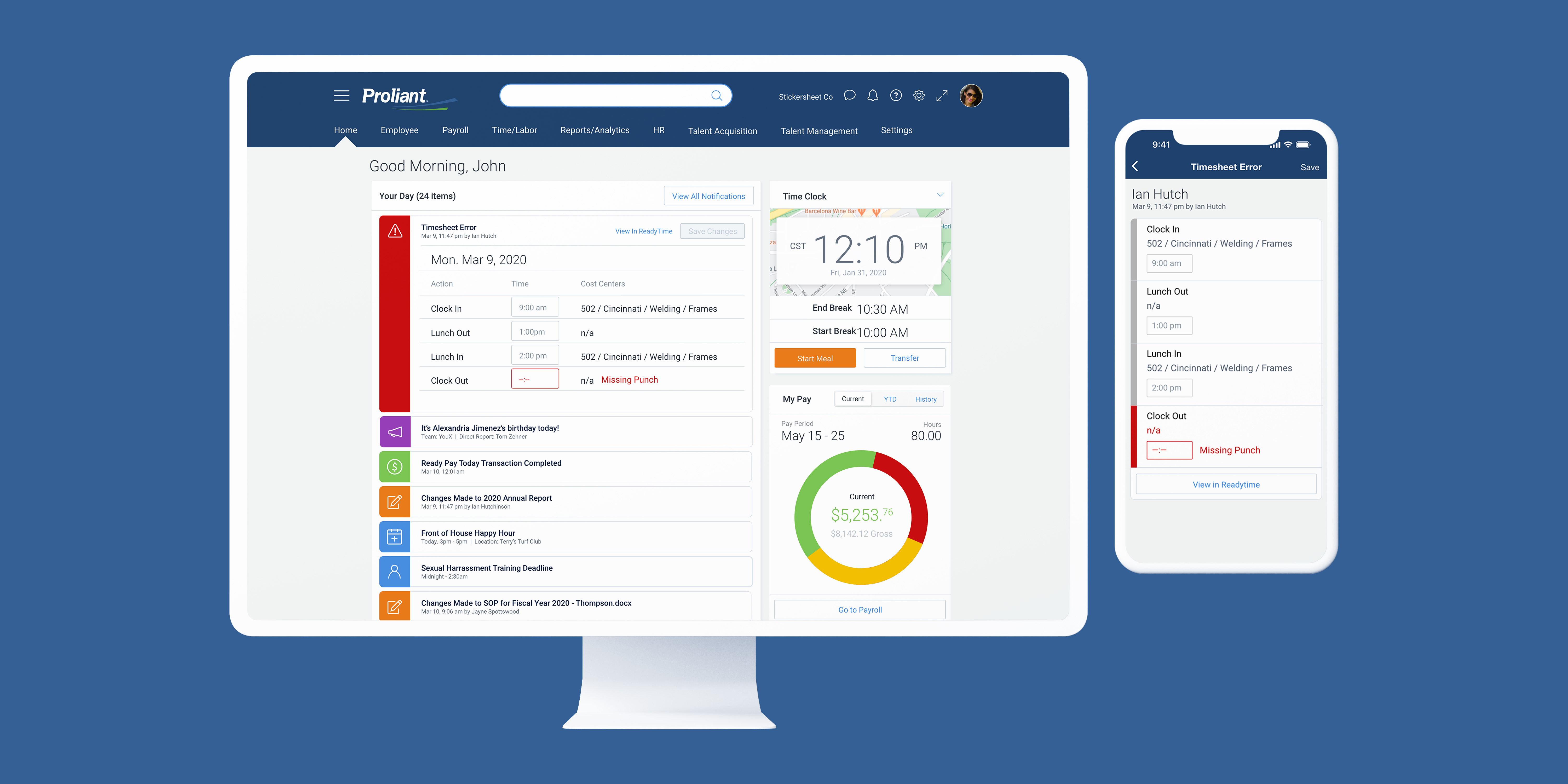
Product Dashboards
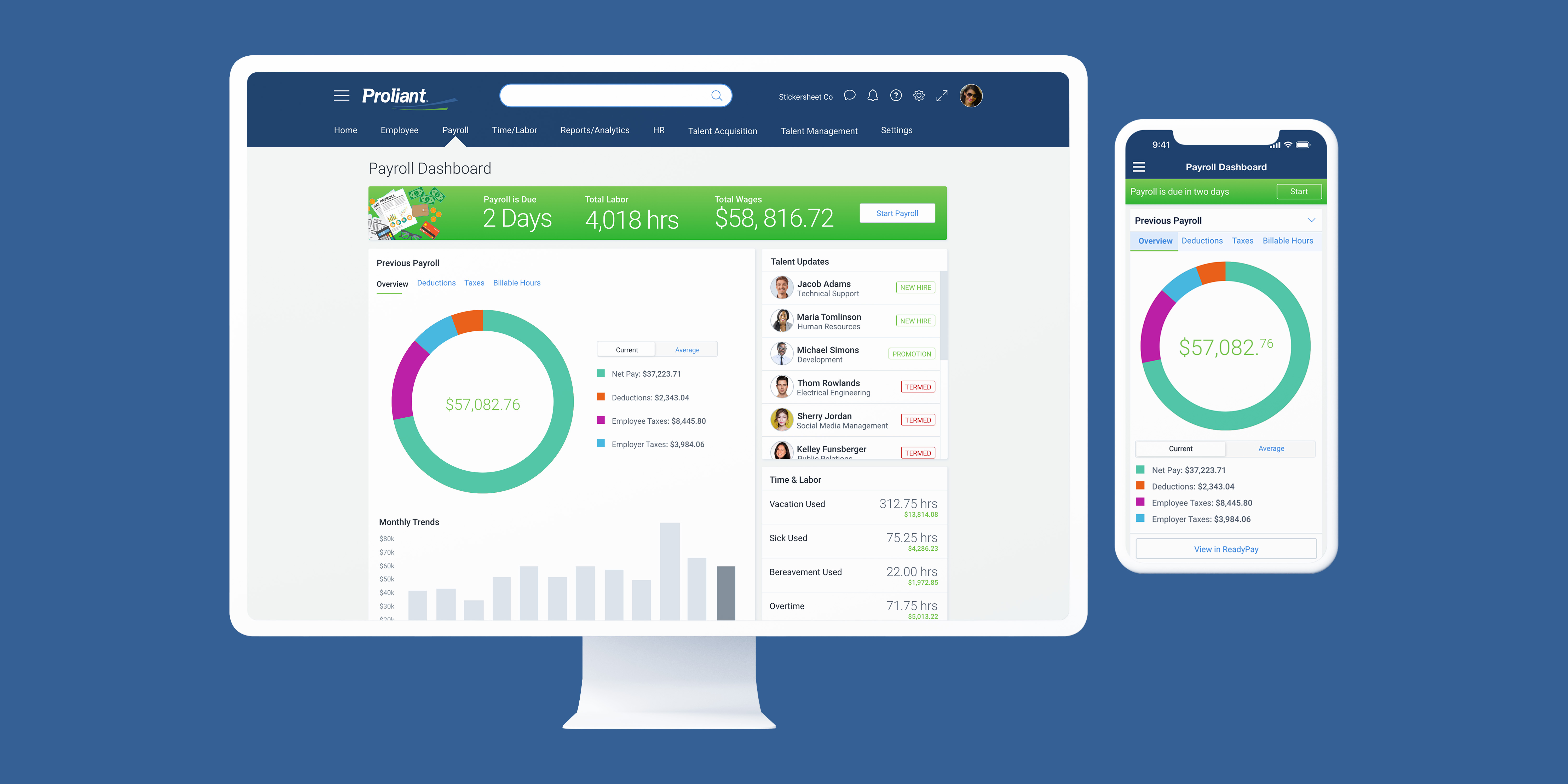
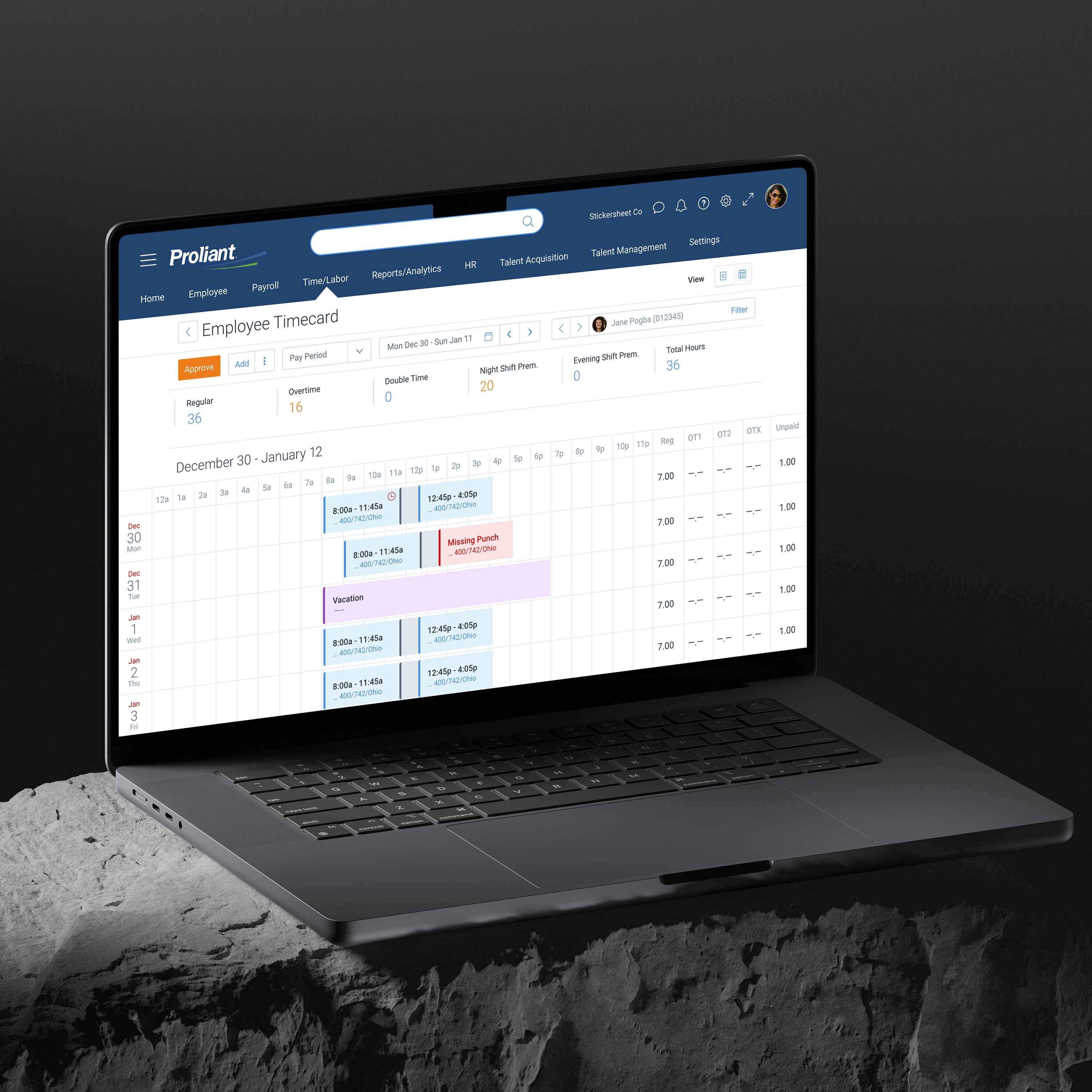
Once a user had executed the agenda from the home dashboard, or in the case that there was just deeper work that needed to be done, there would be product-specific dashboards that would be more specific & targeted. In many cases, a company may delegate the management of different products to different managers. So the goal was to give more time back to the user when it came to "level 2" tasks in the product suite.


Qualitative User Research
I conducted a qualitative user research study to compare the new design flow with a modified design of the current Proliant offering. We wanted to see if a minimal amount of dev effort & design adjustment to the original ecosystem would be fruitful, or if the full dashboard product redesign was the route.In the end, it was clear based on time to click, & even some subtle moments of joy, that the new dashboard system was the way to go.
Related Work
2


Product & Web & branding &
Graphic & Marketing & Direction &
