Proliant
ReadyTime
Product Design
UX research
Product Management
Product Strategy
UX research
Product Management
Product Strategy
2020-2022
Scroll Down
Situation
Proliant's time management software was built on an archaic backend that was slow in performance, created a pile of service tickets from customers around basic tasks, & there was no mobile version of the product. This was all affecting Proliant's ability to sell time management software as part of their product bundles, deeply impacting business in an extremely competitive space.
Tasks
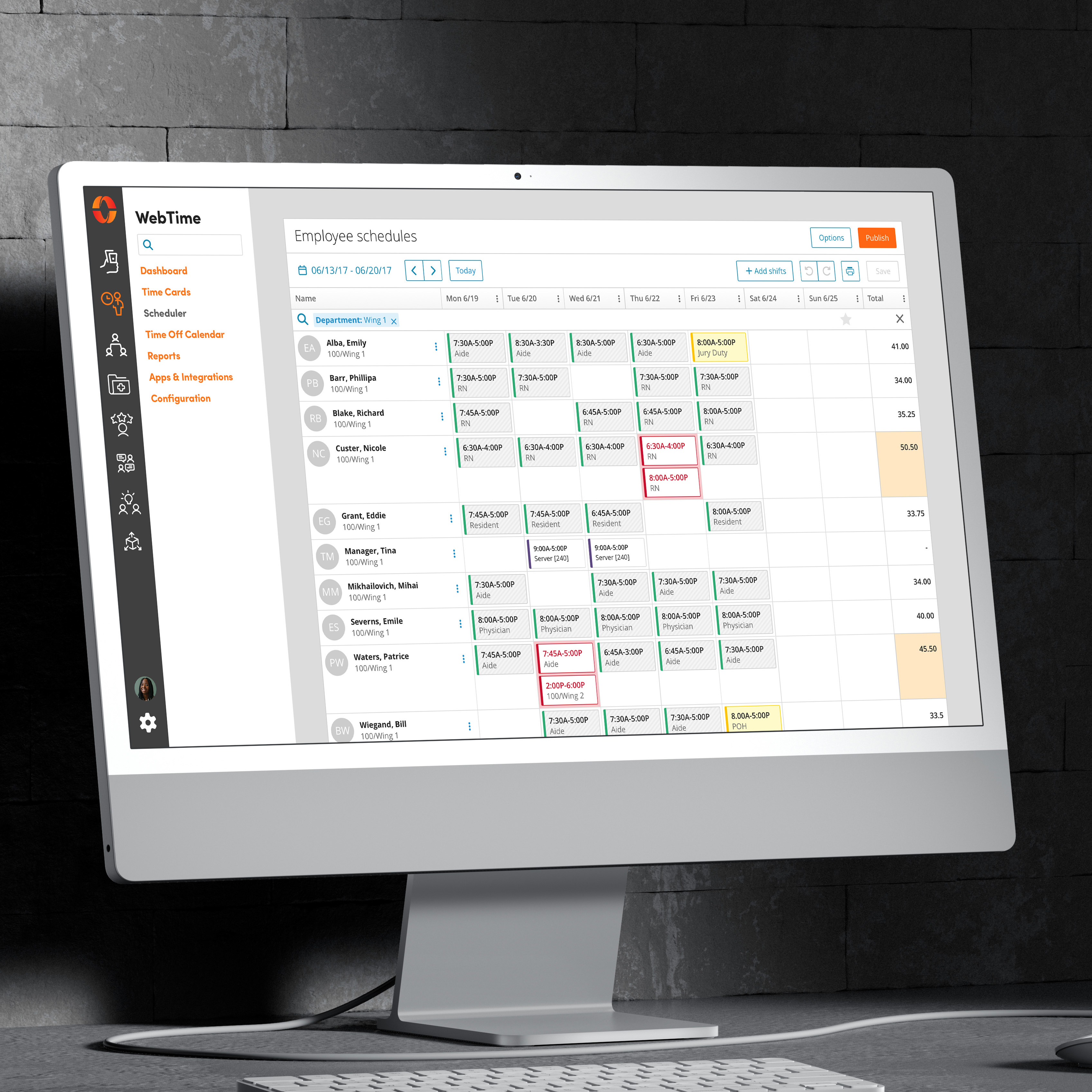
I was tasked with overhauling this underperforming product & bringing mobile designs to its operation. I was brought to Proliant directly from Paylocity, after my years of work on Paylocity's WebTime product, most notably, the Scheduling product.
Actions
The data for the project was there, as was my experience in building time tracking software. We just needed to take the opportunity to see how we could create an innovative product while we were in the workshop. One that could resonate with Proliant's users, while growing the time management segment of the business.
- Conducted stakeholder interviews — Discussed pain points and any outlying goals for this product with product owners, customer service representatives, & upper leadership.
- Performed competitive analysis — Gathered stakeholders for a competitive analysis execution that would ensure we were designing a best-in-class product.
- Engineered user flows — To uncover some of the more nuanced uses of time tracking software, I designed flows that represented our different customer & labor segments.
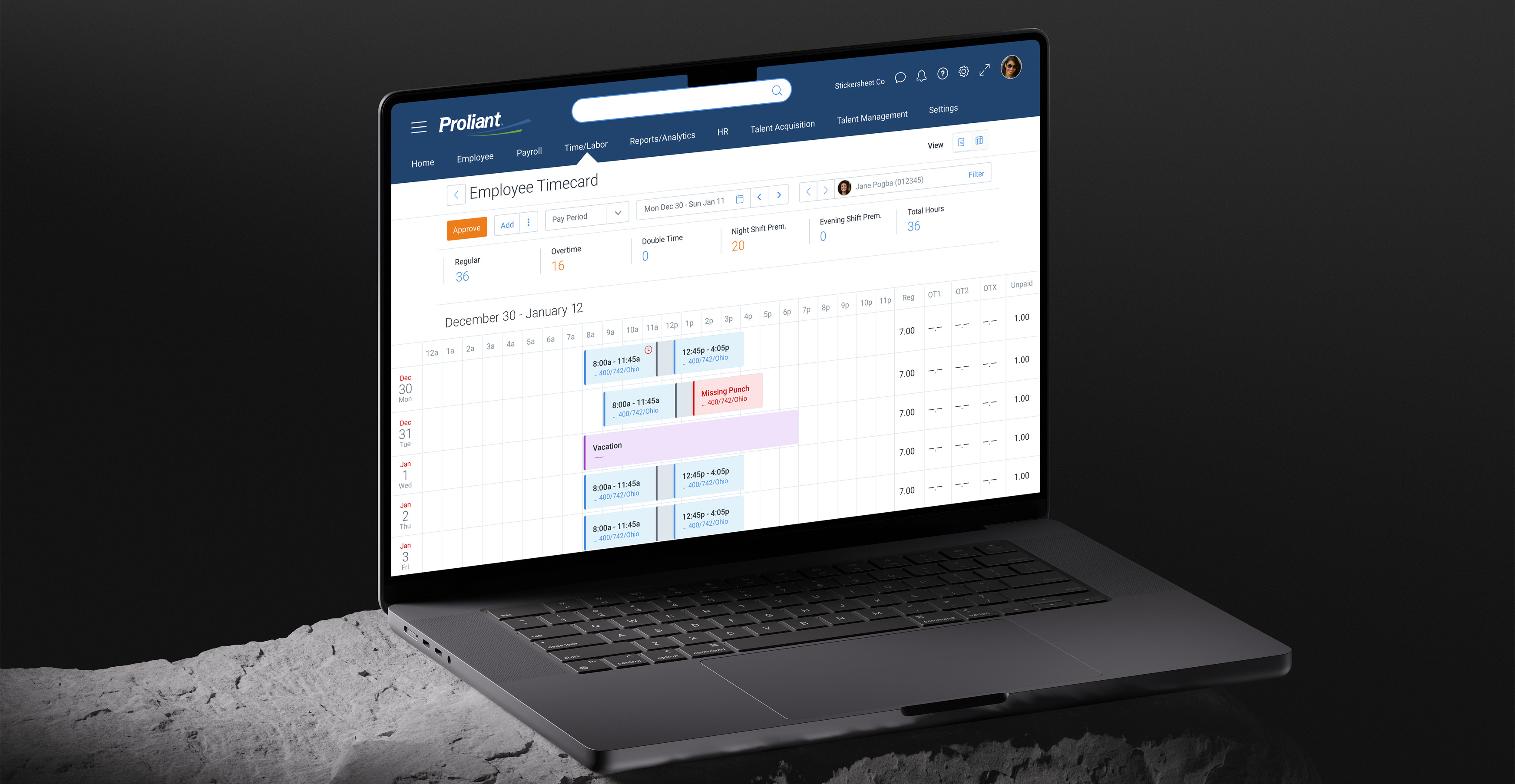
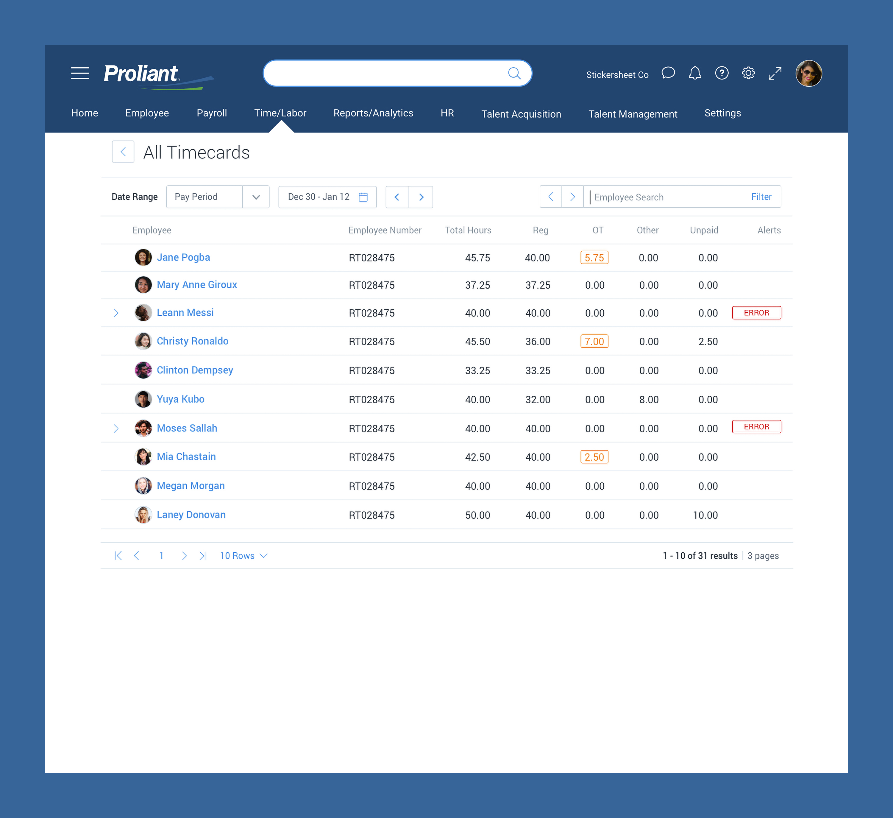
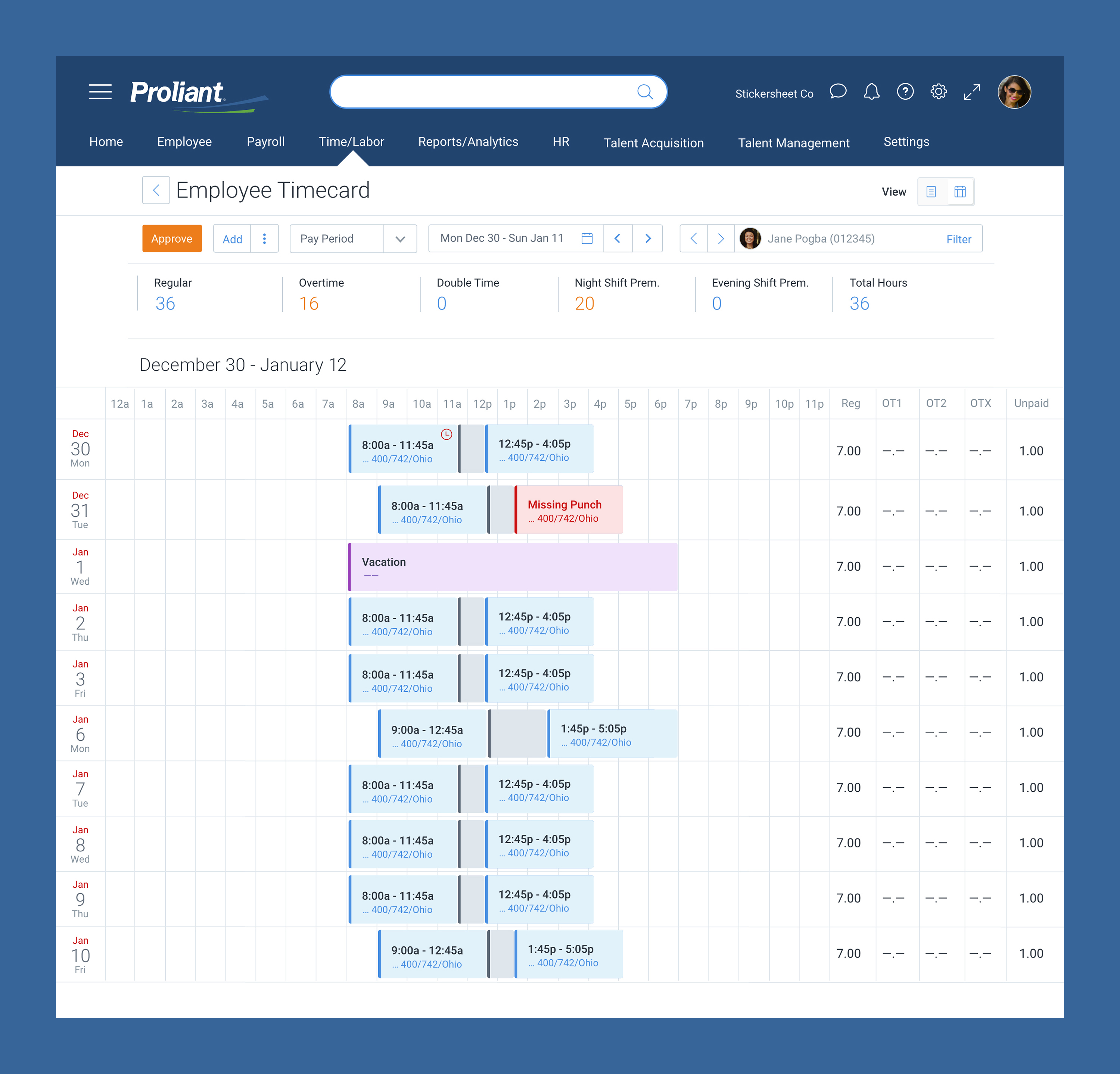
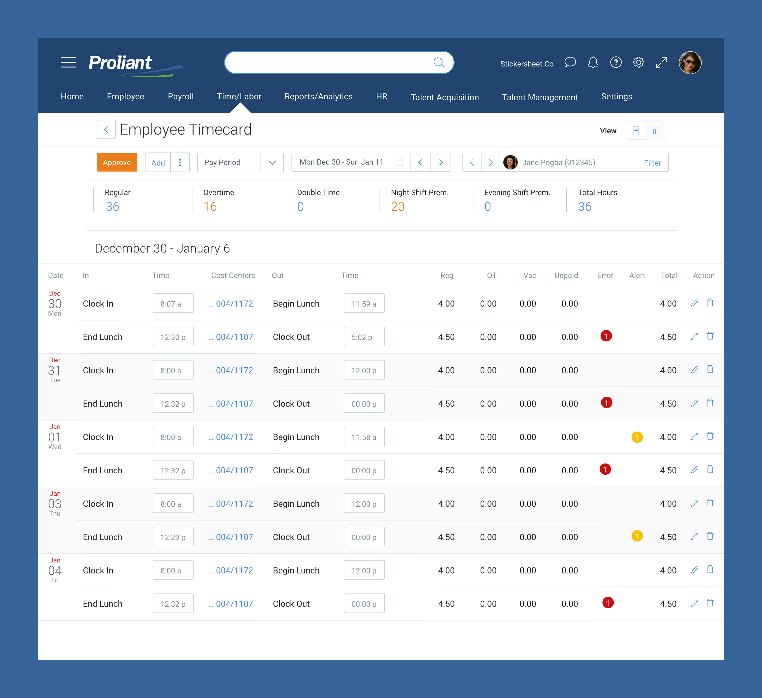
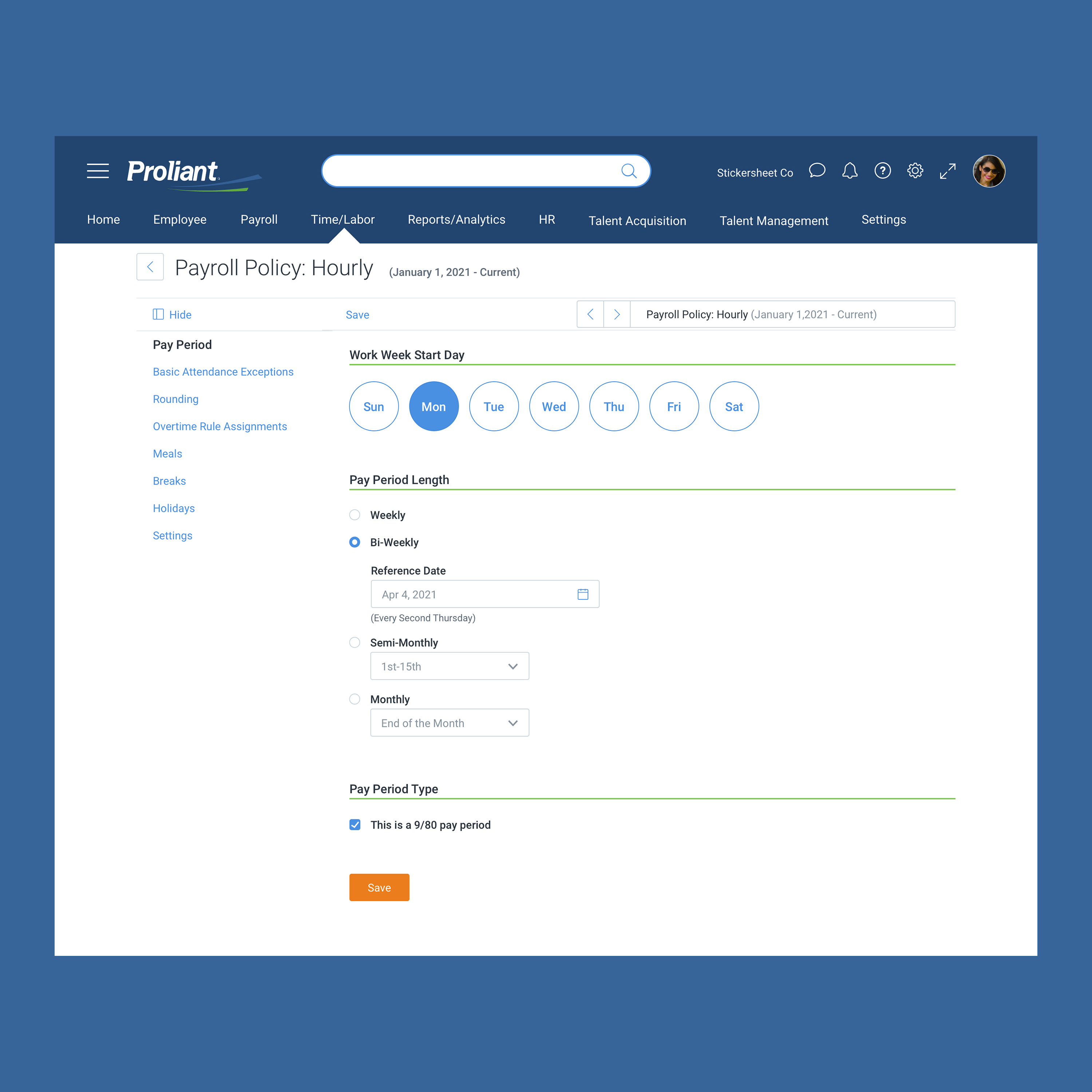
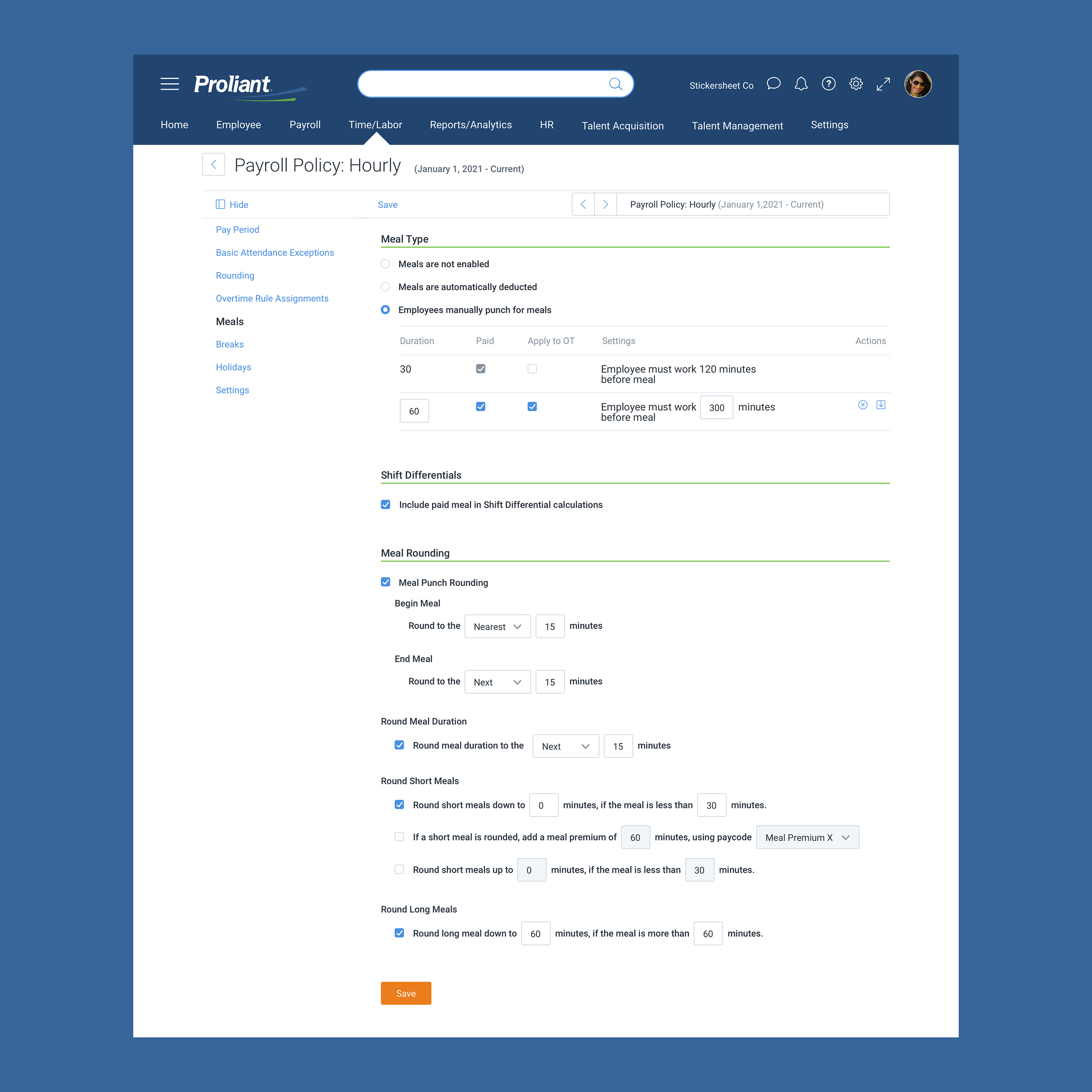
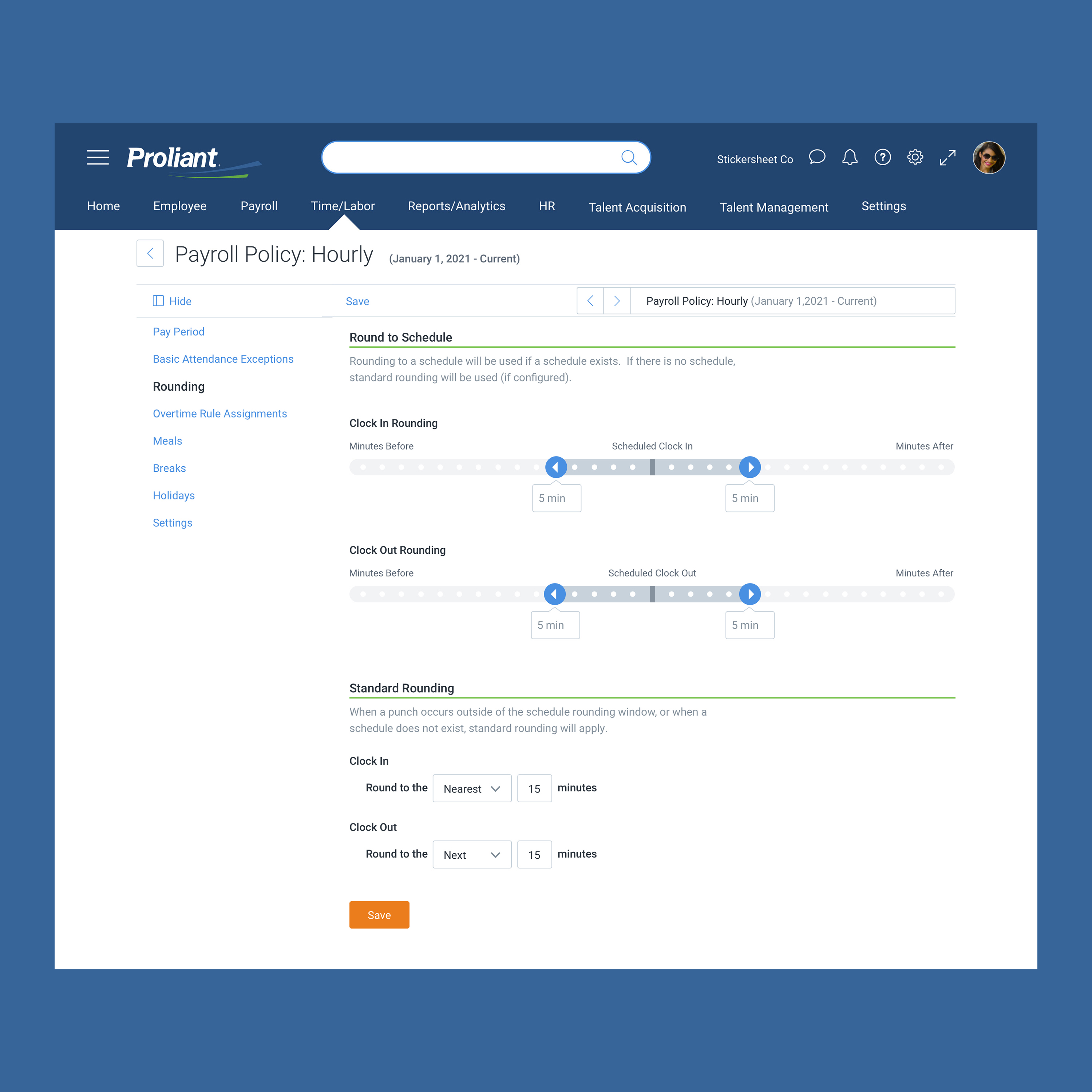
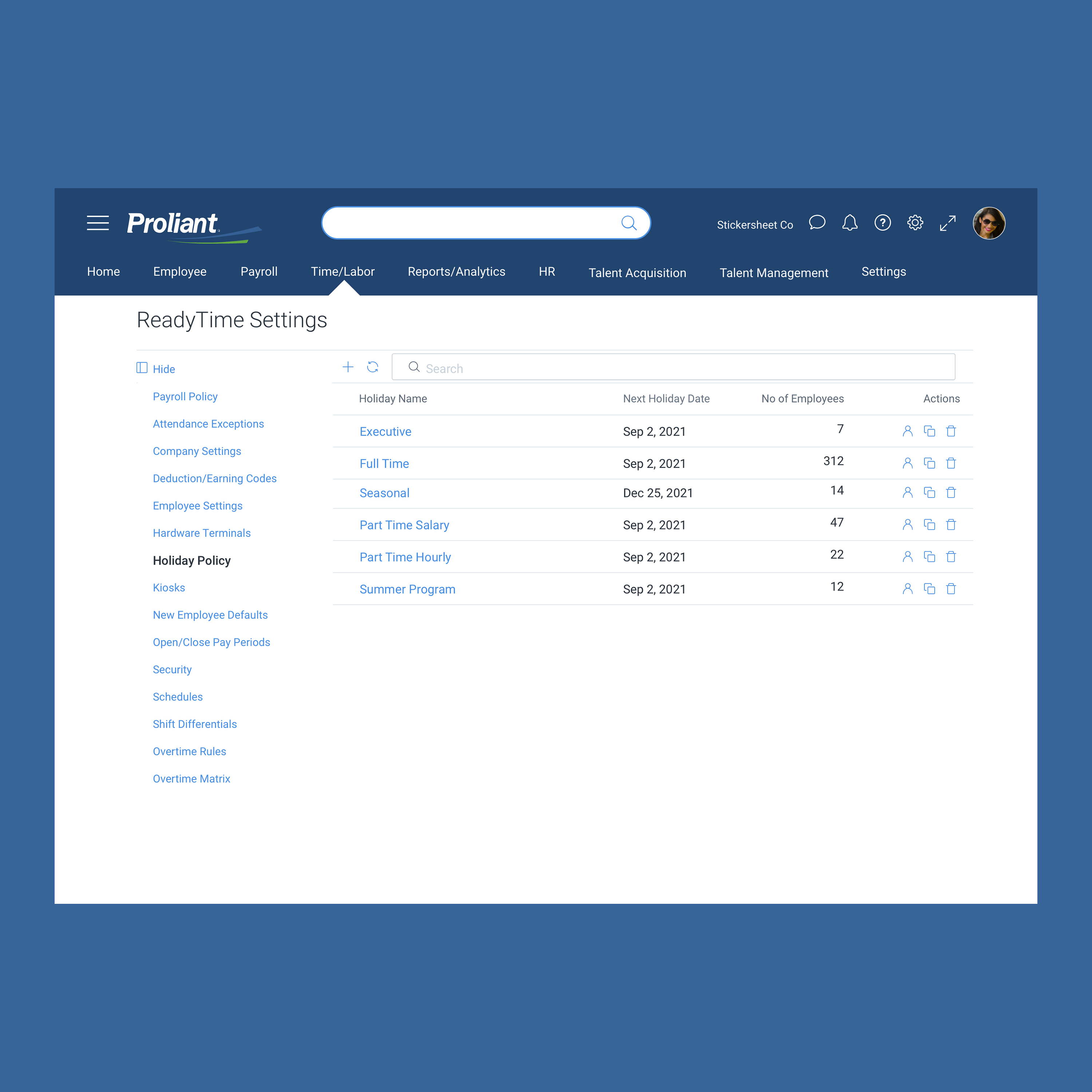
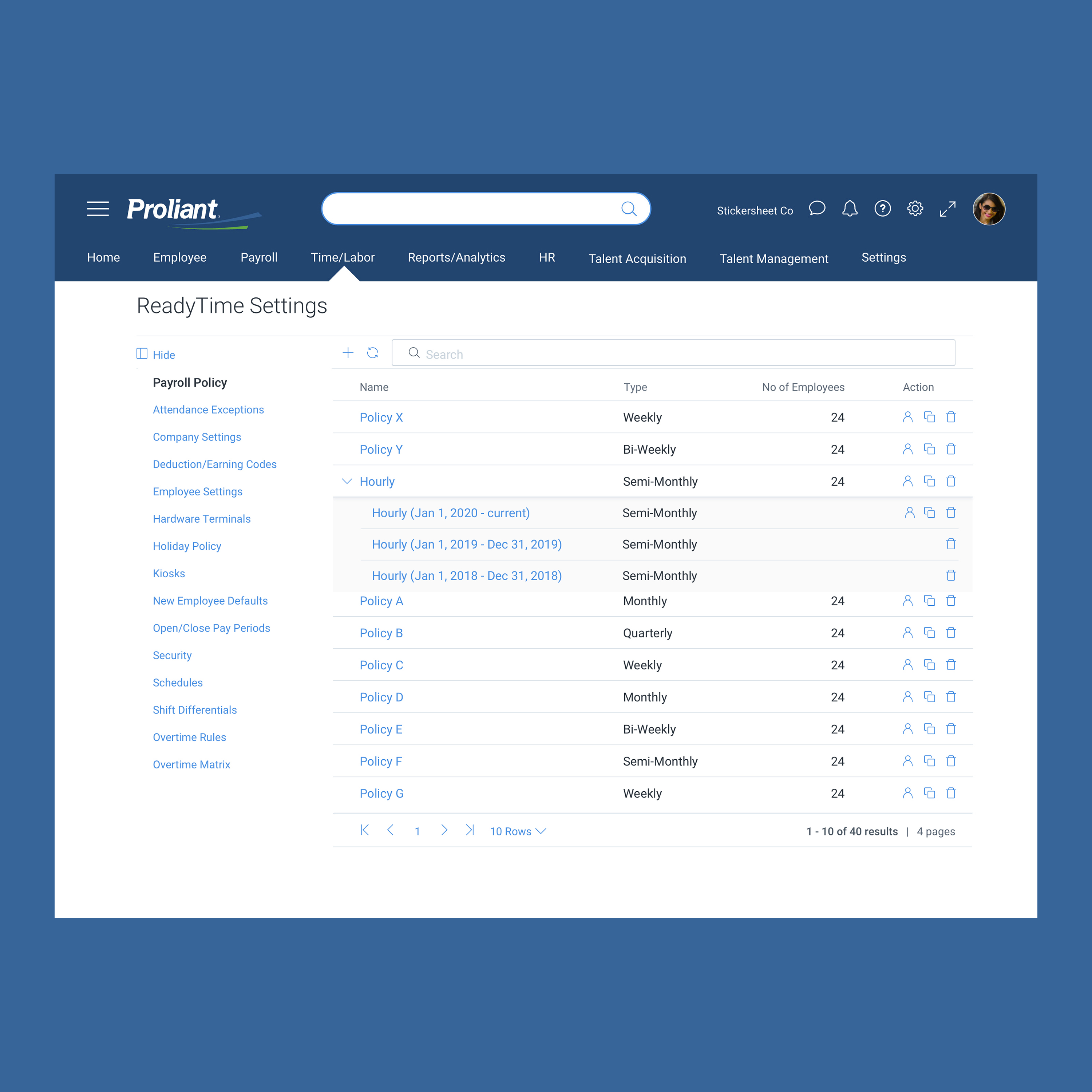
- Overhaul the admin settings designs — The admin backend of the product needed an overhaul that could utilize the evolving design system.
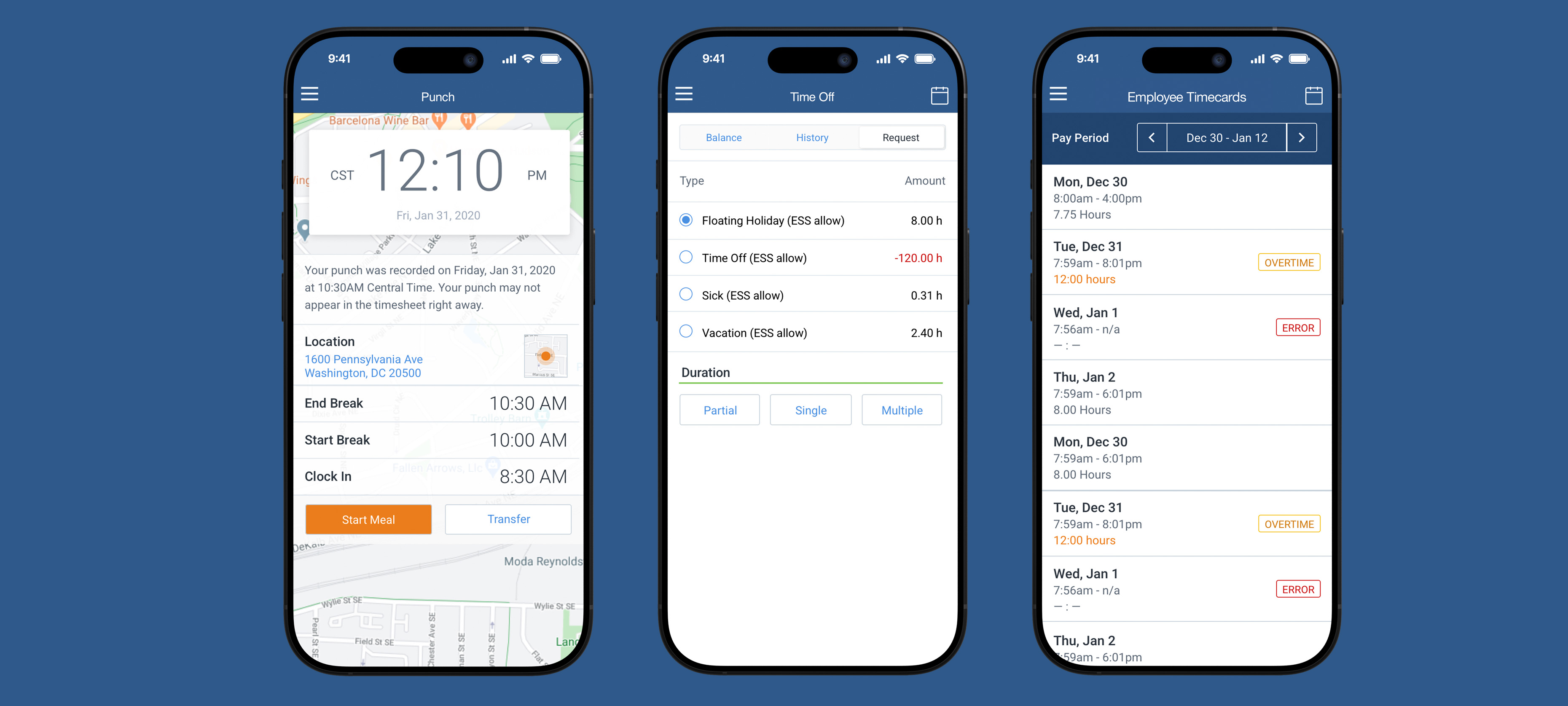
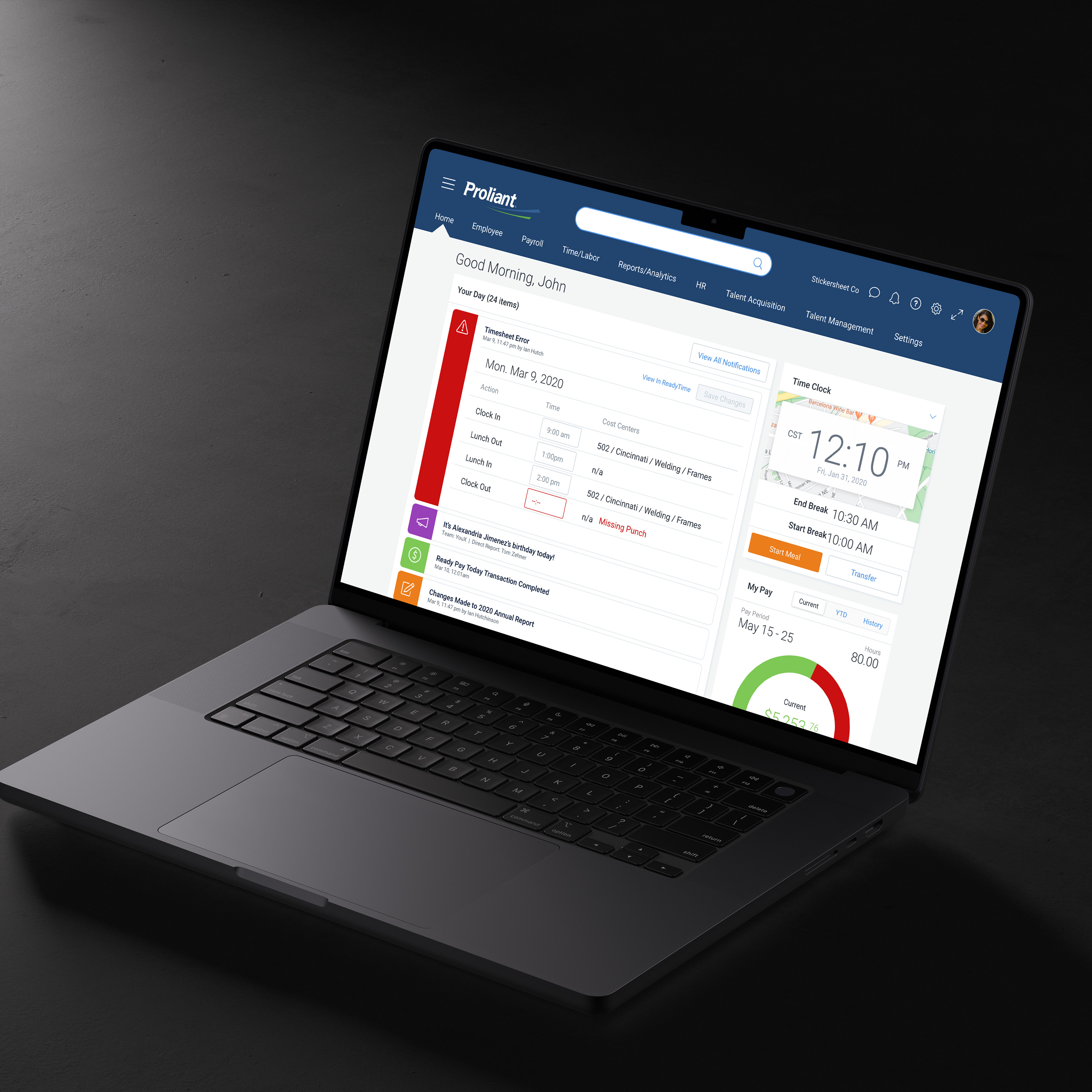
- Designs for both mobile & desktop — Proliant had a mobile app, so the designs for this product could utilize a 2-pronged approach. Like I had experienced at Paylocity, designing a mobile responsive scheduler or time card product was a tall task. So we worked on how the mobile app could be utilized for employees who were submitting time, and the desktop could be a power tool for the admins who needed to accomplish big-ticket tasks frequently.
Results
I was hired for my role as Director of User Experience before this project was launched. So while the page doesn’t include hard metrics like adoption rates or productivity gains, the shift was huge for the company—allowing a product that was slowing the company down to become one that could accelerate sales.
- Mobile has entered the chat— Mobile designs allowed for employee-level users to speed up tasks by using their mobile devices to submit & track time.
- Performance Increases — Users could complete tasks faster, with fewer clicks, and with newfound delight. And data speeds increased thanks to collaboration with engineering.
- Valuable additions to the design system — This project allowed for the UX team to explore new additions to our evolving design system. Modules for the week view of the timecard product were utilized in development of calendar prodcuts, as well as the dashboard overhaul I was tasked with down the road.
Discovery & Design Strategy

Related Work
2


Product & Web & branding &
Graphic & Marketing & Direction &
